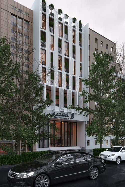

In the City Bank project, which is designed in 6 items, including the ground floor and the existing balcony as a bank space, the first floor is designed as an amphitheater for holding conferences and seminars related to the bank, and the upper floors are designed for administrative units related to the bank. Is. Also, the 1st to 3rd floors are intended for treasury, trust and archiving. In this project, considering the small size of the property and the importance of the surface, especially in public spaces such as banks. we sought to maximize the use of space and surface in the design for the volume of this project, we used a series of porous shells to create the necessary transparency in office spaces and also effectively control the sun's rays. For us, in the design, the facade was divided into three parts: 1. The main entrance of the bank, the amphitheater and the offices located on the upper floors. At the main entrance of the bank, due to the high volume of traffic, an effort was made to be transparent as much as possible in the design, and in the amphitheater part, where the volume of this traffic was moderate compared to the bank entrance, it was changed to the design of moving shells, and in the part The office located on the upper floors, due to the fact that the dynamics and movement are minimized, we used a series of fixed shells in the design. The volume of traffic and dynamics in all three parts had an impact on our maneuver in designing the outer shells. In the design of the project, our main focus, in addition to the maximum use of the surface, has been the use of natural light and the placement of stairs, elevators and corridors on the non-light side.